The worst kind of advertisement for the user but doing wonders for producers around the world. Website popups were introduced to the world as a curse, but this is what users think about them. Producers consider them very important for their products; they can bring in more clients than several other marketing channels combined. These advertisements are annoying for customers when misused. Proper use can benefit not only organizations but also the customers themselves. Some companies avoid utilizing them for marketing purposes. It can ruin the user experience; therefore, several brands don't use this kind of advertisement.
Popups are fun when they provide benefits to the user. Prompting them about offers or new products, details about discounts are also revealed on the website using this method which benefits users and is appreciated by them. So, if intended with good purpose while considering the user experience, they aren't such a lousy advertisement Afterall.
What are Website Popups?
Small windows on websites that come out of nowhere on the screen of the user when visiting several websites are created using JavaScript and high appreciated by marketers around the world. Utilized for many purposes, these small windows can often annoy people if not used properly. There are several types of these advertisement windows that will be further discussed in the article.
Popups are made colourful and attractive to prompt people to click on them. They have offers showing different kinds of prices or discounts that intrigue people to connect them. A call-to-action button is present in them that takes us to a new window where they are inquired about personal information in exchange for some offers. The conversion rate of this advertisement is higher than most other methods of advertising. People are redirected to a landing page using CTA, where they share information with the organization.
Why Popup advertising Works?
It is not essential that all of these small windows will work for your objective because there are lots of things that are required to make them work. Pop-up advertising can be considered efficient when appropriately placed in the right spot for the right audience if you put them where people are filling out information or playing games. It would annoy and would never serve its purpose. An advertisement can work only when it's placed at a place where it doesn't have any impact on user experience along with serving its objective. Experts consider them one of the best marketing methods, and a high conversion rate is responsible for it. Following are some benefits attributed to this type of advertisement:
High Conversion Rates
Pop-up advertising has an exceptionally high conversion rate. These small windows, when appropriately placed, can gain information from clients quickly. Their conversion rate can jump up to 10% in some cases, which is excellent for any advertisement method. It can collect data for the organization from customers and bring customers to the website. Conversion can happen when it appears on the screen during the customer is surfing on the website, and discount offers are displayed.
Grow Databank
These small marketing windows can help with the growth of data banks organizations. Data is collected from people with different methods; companies provide offers to gather data from potential clients. Popups can increase data collection from prospects by influencing them through attractive offers. CTA is placed in such a way that consumers cannot avoid them, eventually providing all their information to the corporation. The corporation can late utilize data to approach customers for sales purposes.
Increase subscribes
Subscription to an offer or to a website can benefit the organization. They gather data by the subscription form of customer, which helps profile customers. However, consumers can be prompted to subscribe to an offer or website through pop-up advertising. Consumers look at flashing offers and get attracted to them. This influences them to provide their data and subscribe to the website. On website popup ads can help with subscriptions; sometimes, they do not disappear until the user is done subscribing to the website.
Improve Lead Generation
Lead generation is a process where an organization utilize different tactics to gather new clients. They use other marketing channels for these purposes. Information about the customer is collected with the intent to initiate communication. The ultimate goal is to convert the prospect into a regular client. Website Popups assist the organization by gathering data of consumers, redirecting consumers to new landing pages with the help of CTA, where they provide their personal information to the organization.
Lead generation can improve by utilizing this channel of advertisement. There are different types of popups that can help marketing departments in several ways. On the website, ads are also displayed using these windows. This way, they can help the organization increase their outreach by providing the basis for lead generation.
Top Types of Popups to Use on Your Website
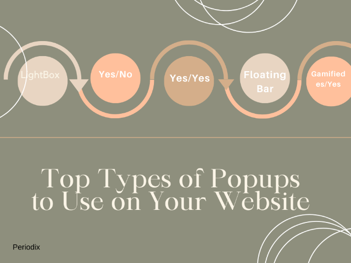
There are several types of it; they have different uses. To gain the most out of an advertisement, it is essential to use the correct type of popup. Companies use different styles with different scenarios. They all serve other purposes, and each of them can cause hindrance if not used properly. Design, offer and placement are all of these things matter, along with the right type to make it work properly. The following are types of popups to use on your website to help you grow your audience:
1. LightBox
2. Yes/No
3. Yes/Yes
4. Floating Bar
5. Gamified
6. Scroll In
7. Fullscreen
LightBox
These are the most commonly found types of pop-up advertising appearing on most websites visited by the user. They have a high conversion rate and are therefore often used by suppliers and organizations for lead generation purposes. Like any other type, it also has a CTA, which allows producers to redirect users to their landing pages. Appearing in the shape of a small window on the screen, these box-like ads do not cover the whole stress; the rest of the winddown gets a little darkened. Users can easily remove them off-screen by clicking on the cross on the ad.
They provide assistance to the marketing department in gathering data on prospects. They have attractive designs and are built to gain the confidence of the user. Website popup like these is mainly able to collect the information of the user. They influence the user into taking the bait; the user ends up clicking the CTA button, which is visible in the ad—redirected to a landing page which further guides the user into submitting their information to the organization. These hovering windows are the most common types.
Yes/No
This is another fascinating type of the ads which appears on the website. They appear as a bright window over the screen user has intended to open. Their bright colours attract the user. The unique thing about these advertisements is that they only have two options. No cross signs are displayed anywhere on ads; users just have to select yes or no in order to redirect or open the intended screen. They are also very efficient in their work because mostly Website Popups require emails, which users hesitate to give away; however, simple yes or no options are much easier, and users do not hesitate much to select any one of them.
By selecting the yes option, the call-to-action button takes the user to a new page where the organization give offers in return for their information. Mostly email addresses are demanded; these types are highly efficient in providing desired results to marketers.
Yes/Yes
Yes/Yes popups prompt users to take action; however, consumers are not redirected to a new page. Keeping on the same page, they are taken to the desired item displayed in the advertisement. Websites utilize this type of ad to market their special offers. Discounts available on products are introduced using such methods. Intended to favour clients, they do not ruin the user experience; instead, studies showed their positive effect on user experience.
Appear as a small window over the website; the remaining page is blurred and darkened, highlighting the offer presented. A call-to-action button is available that would redirect customers to the same page; however, some information is required in return. Users not interested in offers easily remove by clicking on the cross sign displayed on the corner. Highly influential and most successful in gaining information from users. This type of advertisement is advised by experts for on-page redirection.

Need more warm leads ?
Outsource the routine process of lead generation with Periodix
Floating Bar
The floating bar, as the name suggests, has the shape of a bar mostly displayed on top f the website. However, the top spot Is not essential for floating bar popups. Websites also show them at the bottom for better visibility. Mostly in bright colours to attract audiences towards them. User experiences are not disturbed by utilizing such ads. Merged in the website look like a genuine part of the website; however, a CTA button is added for redirecting customers to a new page. The floating bar is displayed by the action of customers showing interest in specific items.
Often displays offers or discounts available on the website or any other website that ensemble the interest of the customer. They are created in such a way that they attract audiences, flash news over websites utilize them to display information, movement is essential for an advertisement to be visible to the visitor on the website.
Gamified
Gamified popup displayed in the centre of the window, prompted by the action of customers on the website. They are very eye-catchy and sounded like a game; users are intrigued by such a popup. The wheelspin game is often part of such advertisements. Where users are offered rewards in exchange for playing games. Baiting customer is playing the game and the required answer to provide the offer. Such types of advertisements are able to achieve targets.
Spin wheel game is not essential for advertisement; several other game-like offers are displayed, which like in the same category. Shown in the centre remaining screen is blurred. Consumers, if they require escape, can click the cross button to close such windows. Pop-up advertising like this prompts users to press on CTA button. Often successful in generating information from users, organizations utilize them for audiences who have curious nature. Offers provided have to be worth the information being asked from the user.
Scroll In
Scroll In is another type of website popup displayed on the website; they appear in the corner of the website, not disturbing the user experience. Such advertisements display offers that prompt users to provide their emails to gain such offers. Small discounts on products or coupons are displayed over the website using such ads. Created to be visible in the surroundings but still discreet enough to not disturb the customer on the website.
E-commerce websites utilize them for providing discounts on the personal information of users, the conversion rate is not high enough, but organizations caring more about user experience utilize them on their websites. They often are seen as discreet advertisements that do not disturb audiences but have enough worth in their offers that they are able to gather many emails for the organization for their lead generation campaigns to be successful.
Fullscreen
The most annoying type of popup they cover the whole screen of the website and don't allow movement without getting data from the user. They are aggressive types of advertisement mainly not utilized by customer-centred organizations. They are the most annoying type of ads, which ruin the consumer's experience. Providing data is the only way to access the website, organizations whose websites are essential for consumers to use such ads because the consumer has nowhere else to go.Full-screen ads cover the whole screen, and no part of the website below is visible to the user. Conversion is inevitable with this type of aggressive advertisement.
Conclusion
The article gives data about several popups that are utilized by organizations to gather data from users. The use of these annoying advertisements is increasing with the increased need for lead generation. It plays a vital role in collecting data on the customer; the conversion rate is higher than in other channels. Different types of advertisements are used on various occasions to capture users' attention.


